Overview
In alignment for our new brand guidelines, some of the logos that previously existed in our libraries required updates. All of the logos had to have:
Updated typography treatment
Updated color treatment to reflect our current color scheme.
New solves for how icons are treated in addition to the typography.
Below are several projects that needed updates to adhere to brand guidelines. While there were some concepts I wanted to move forward, the ones chosen reflected the needs of the requestors.
Director: Phillip M.
Manager: Anna R.
Designer: Trey J.
ERG Logos


With the updates to our brand guidelines, there were some previous treatments that we couldn’t use anymore. In previous logos, our droplet was used extensively and with the guidelines we had to reduce usage.
In order to maintain the uniqueness across the different group and allies, it was important to use similar color treatments. Below are some of the sketches I created for this project that communicated allyship.

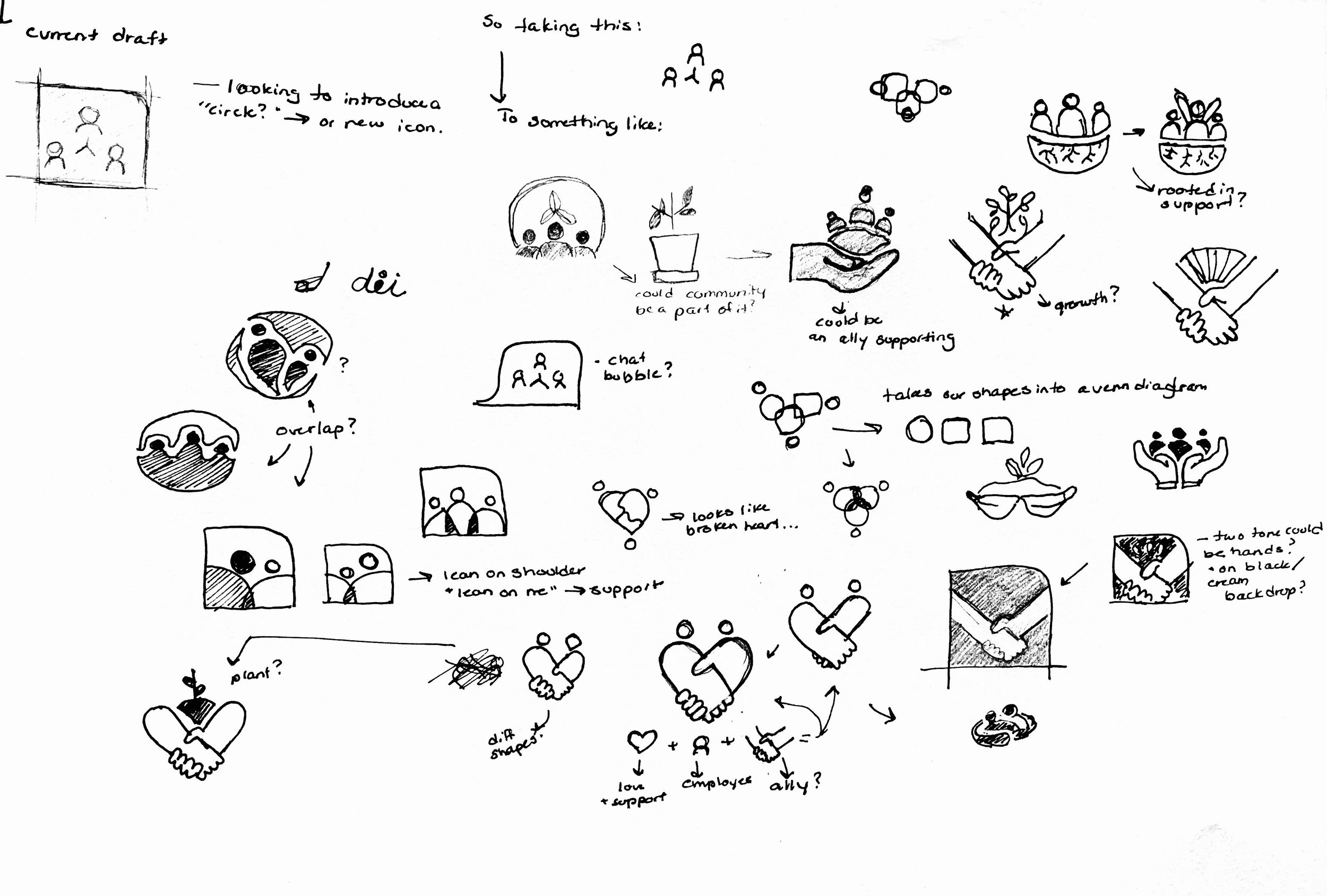
As we continued to evolve the concepts, there were some solves that I thought could work across different use cases. There were some sketches that presented a unique opportunity to change the look while also keeping similar elements.

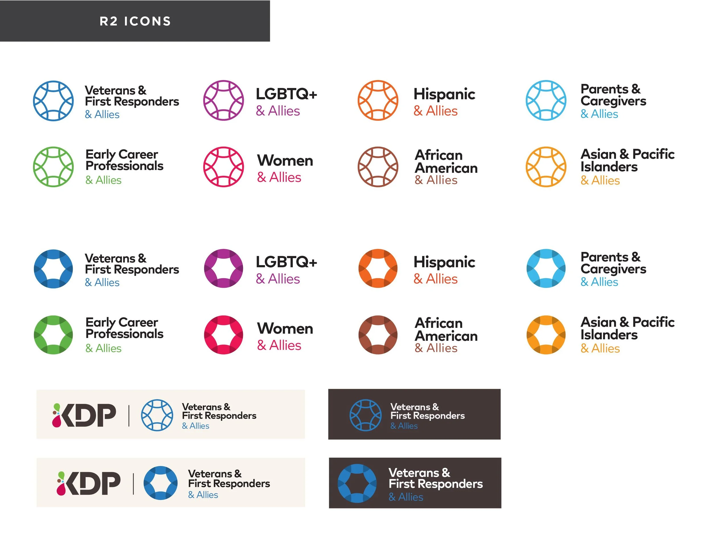
While there were some great explorations for the concepts, we landed on the below for the final logos. This set keeps things consistent with our brand guidelines without sacrificing the look of the previous logos.
Final Logos
Diversity & Inclusion
ERG Logos
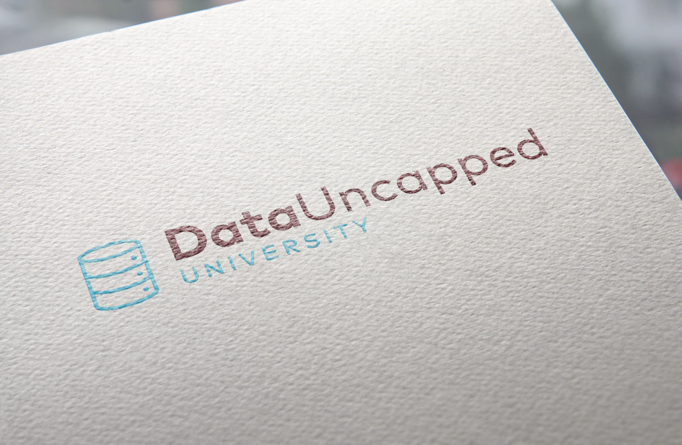
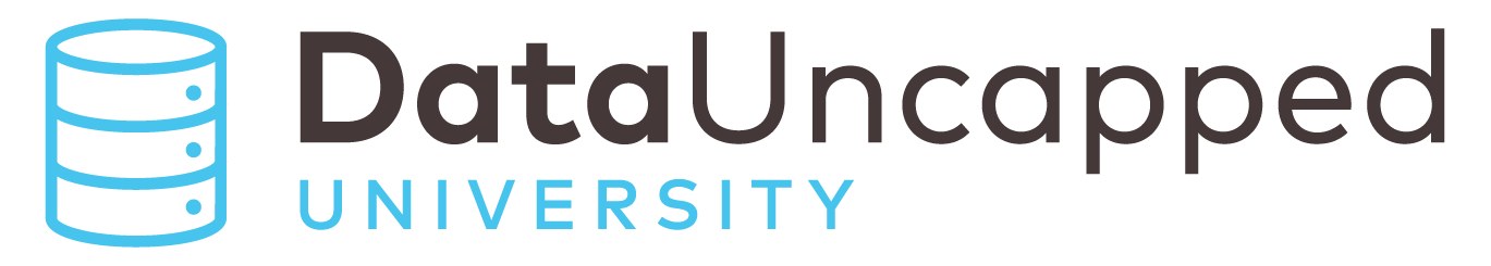
DataUncapped
Branding Update
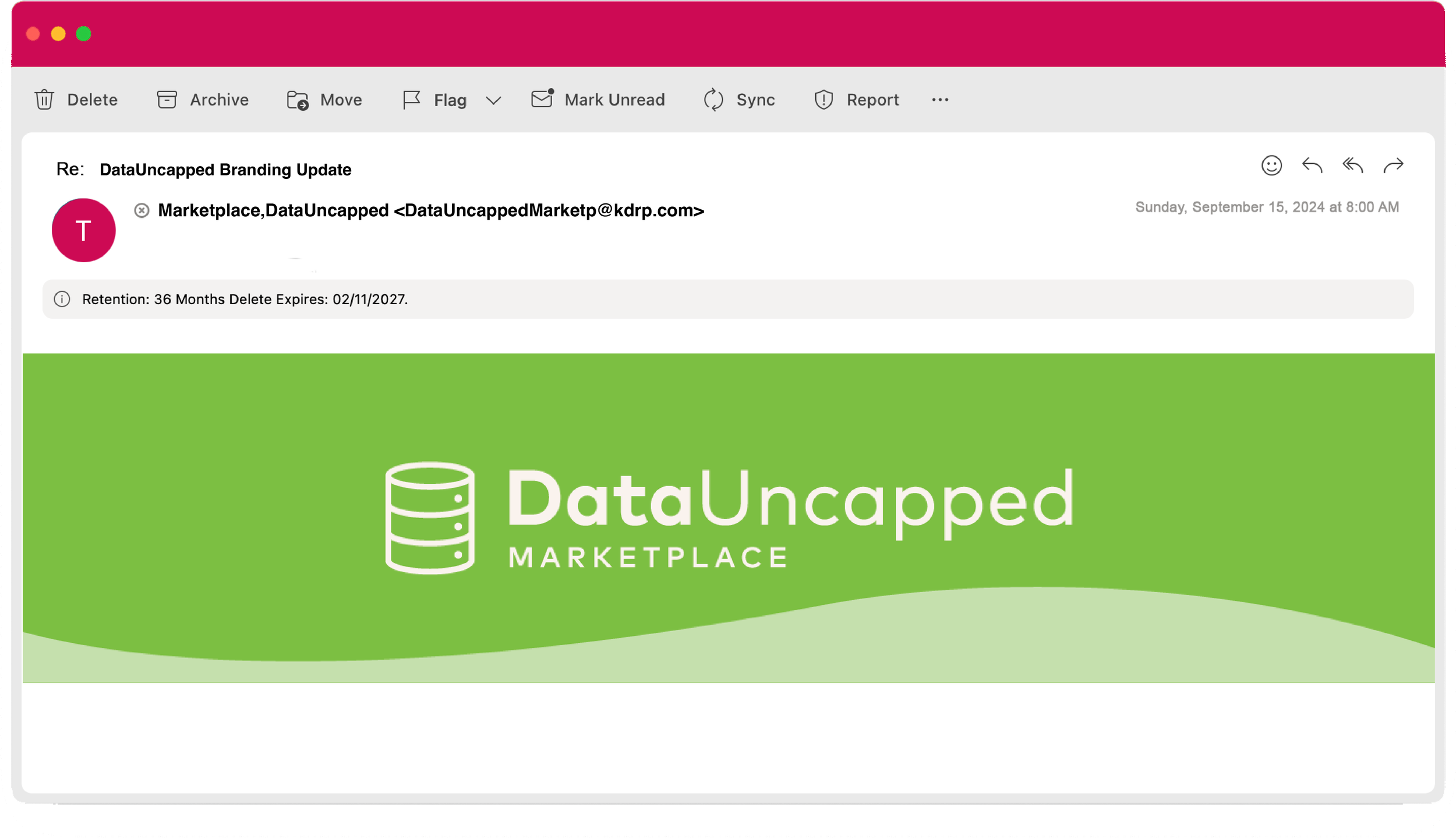
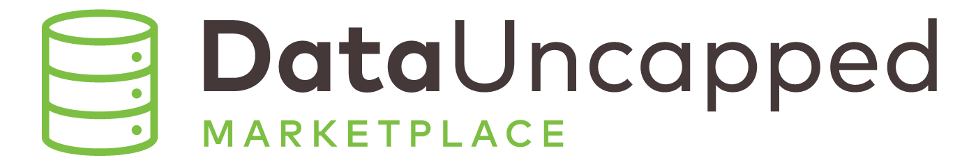
For this project, we were tasked with updating this logo to fit more within our brand guidelines. The unique solve for this was including an icon that best represented data while also omitting the water droplet.
Throughout the process of creating these logos, we were met with a few challenges. They included utilizing the right icon, how to approach sub-brands treatment, and how these translate to use cases like email banners. For the first few rounds, we explored lockups with our current iconography. As we progressed, we created new icons to represent a “data stack”.


Final Logos
Main Logos
Sub-Brand Logos
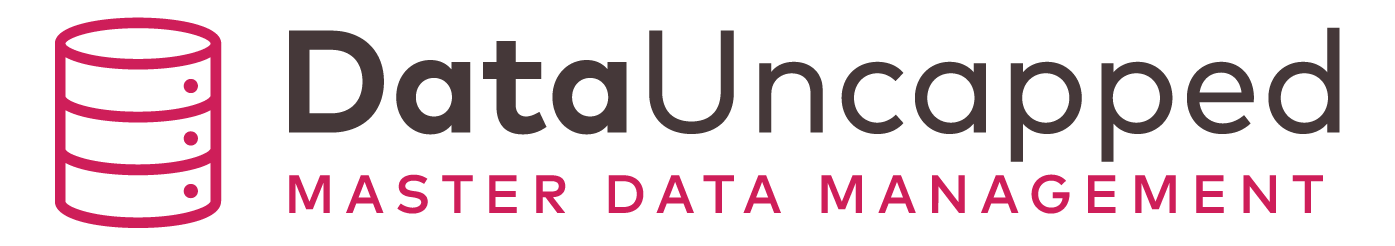
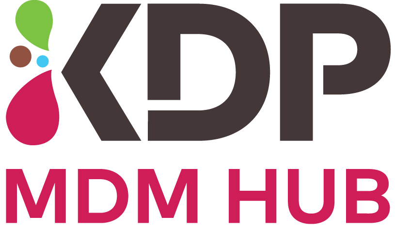
MDM HUB Logos

Use Cases